Anatomy Of A Broadway Poster - The Story Behind The Art
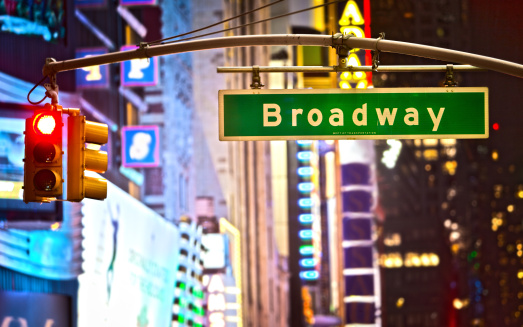
The ubiquitous Broadway poster is more than just eye candy for the busy New Yorker and tourist. These pretty pictures, which cover so much of the city, convey — or at least suggest — the experience a Broadway production holds for the potential audience member. What will you see, hear and (hopefully) feel once you plop down your hard-earned money for a seat in one of Broadway's storied theatres? It's a show's calling card. It helps put people in seats.
Upon first glance, a Broadway poster may seem deceptively simple — a picture or graphic with a title and some credits. But a lot of very creative people put a lot of thought and effort into creating what's known in the industry as "key art." It's this key art gets that gets spun off into the countless versions you see online, in the subways, outside theatres and above Times Square. The final product, in all its forms, depends on the show and the audience its producers wish to attract.
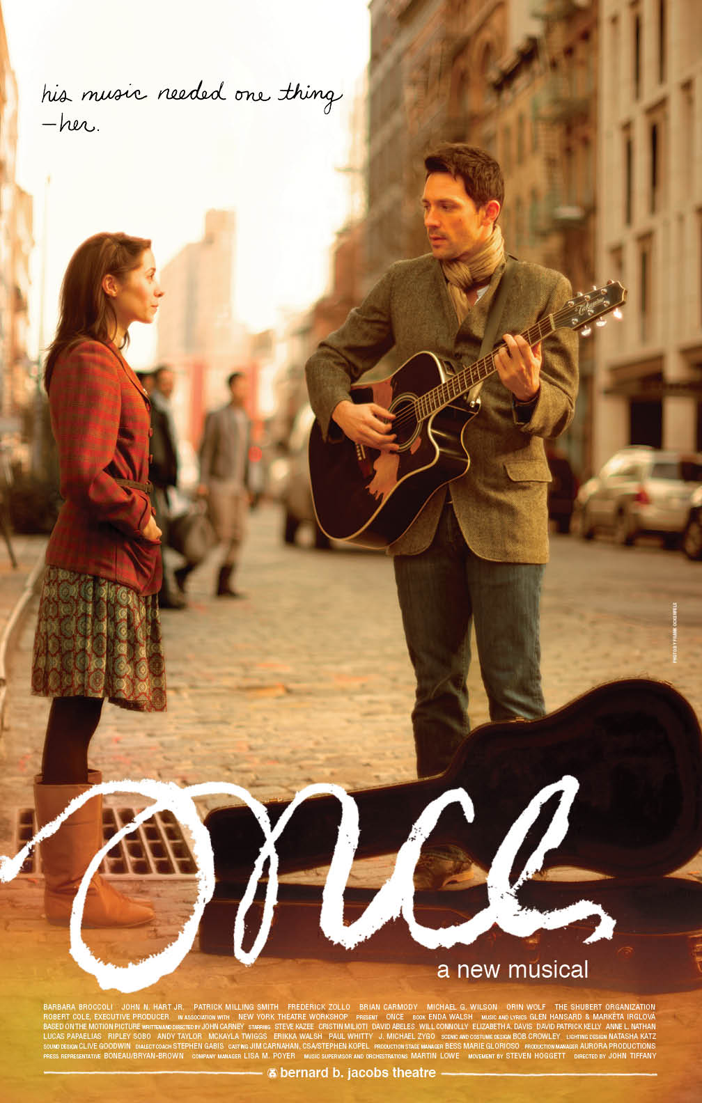
For Once, the Off-Broadway transplant about an Irish musician and a Czech immigrant brought together by music, the challenge was to reinvent a personal story for a broader audience. As Darren Cox, Associate Creative Director at SpotCo, an advertising agency that handles many of the most successful Broadway shows, explained, Once "...was this little fantastic gem of a show downtown that just flowered into this huge success." The original art, which SpotCo also developed, had a "...very personal, slice-of-life kind of aesthetic, which was very intimate and really really good for downtown, but we found out that other needs arose when the show moved to Broadway." The bigger stage and the bigger potential audience required an updated look and feel to get noticed.
The art needed to pack more of a punch. According to Cox, "there was a little bit of a fear that the intimacy of the show and the kind of quiet beauty of the show could be sort of swallowed up..." The solution was to hold on to certain artifacts from the original as inspiration and then dial everything up. They hired a photographer and shot the actors in real environments — in the theatre, on the street, at a bar. "And then we pulled back in some of the graphics and the logo treatment that had that downtown intimate feel, but then married it to the larger brand." Looking at the original and updated art "...you can really see there is sort of this relationship where they do feel they're kinda like in the same voice but one has a much stronger, louder, much more splashy kind of voice."

One Man, Two Guvnors, a comedy about an easily confused man who agrees to work for both a local gangster and a criminal in hiding, required a different approach. The play, starring the talented comedic actor James Corden, came to Broadway from London's West End. As Cox explained, "It was something that already has a lot of traction and success, and we wanted to communicate that. But we wanted to communicate that in a way that was fun, interesting and sort of off-kilter like the show." The show had received rave reviews from British audiences and press, a sort of stamp of approval. But it still needed to be introduced to American theatergoers.
"We knew we had a star in James Corden," noted Cox. "And the art very much reflects that by hitting pretty hard the cred that it's gotten from England." In addition to the show's star in a pose that suggests the play's physical humor, the poster features glowing comments and five-star ratings from various London papers. "The National Theatre in London has a great track record of doing really wonderful shows," according to Cox. "So we thought that that would make it more comfortable for consumers." The goal, in this case, is to make the unfamiliar seem familiar by lending it some credibility. "We really tried to build that into the artwork so that people knew this was ... an established brand."
Get the latest buzz on the Tony Awards.
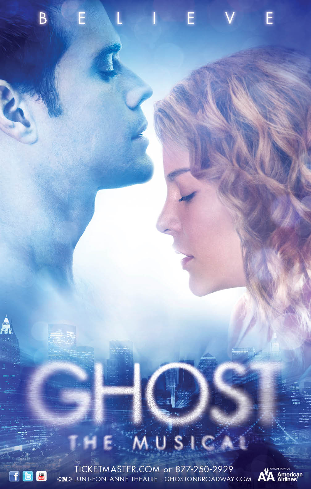
The art for the musical Ghost has a different challenge. Potential audiences are already familiar with the movie starring Patrick Swayze and Demi Moore; the pottery wheel love scene alone is one of the more famous moments in movie history. How can the poster for the Broadway retelling leverage all that goodwill yet still point to something new? "It wasn't just about re-introducing audiences to something that they already knew," said Cox. "It was really about trying to communicate that this is Ghost ... but it's something different."
The show has a strong technology vibe, from the sets to the visual effects to the music, that lends itself to the general ghostliness of the production. And the art accounts for this. "We chose to show the city at night, which has this more of a Tron feel," explains Cox. "The logo is heavily affected to make it much more operational, and the photos are fairly heavily treated to give them a much more contemporary ethereal feel." Everybody knows that the character Sam dies; there's no need to position this as some big reveal. But like the rest of the story, it's handled in a unique and interesting way. "The goal ... is to try to implant those feelings in people and to lead them towards it without sort of hitting them over the head with it."
Like a good movie trailer, the poster aims to pique audience interest without answering all the questions. Fall short, and a poster doesn't get noticed. Go too far, and a poster doesn't leave any room for curiosity. The end goal, after all, is to drive an audience into the theatre. And what better way to do that than to make people think?